In spring 2021, students in the RISD Industrial Design course Design Principles II (DPII) created expressive functional forms using insights derived from visual and contextual analysis of art from the RISD Museum. This three-week exercise on form was called “Extraordinary Ordinary." I am an architect who has worked at the product design scale for the past six years; I am an experienced educator, but this was my first term as an adjunct professor at RISD.
This project is one of two intro projects for DPII, which was taught as a hybrid studio course this term. DPII focuses on design methodology and practice (making, materials, form, mechanisms, and design research). DPII is team taught and the faculty all work from the same basic assignments but customize them based on their expertise and interests. With each new project, students build on the skills they learned in DPI, from concept generation to sketching, iteration, model making, rendering, storytelling, and presentation skills.
Our goal for the first class session was to analyze three works of art at the RISD Museum and derive three insights from each. I invited the museum’s Academic Programs educator to introduce the concept of insight-finding over Zoom during the first hour of studio. Through facilitated, inquiry-based conversation around a selected work of art, the students learned both about visual analysis, which students would do in the museum, and contextual analysis, which students would do once they returned to the studio. Students were prompted to use these two types of research to find insights. In the context of visual analysis, I defined an insight as an observation not immediately apparent at first glance. In the case of contextual research, an insight would be a hidden truth, something counter to a dominant narrative; something surprising.
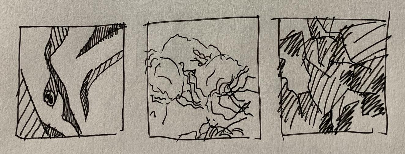
Following our educator-led Zoom conversation, we headed over to the museum in the rain. Because my students were second semester sophomores who had a little more than one semester in person before the switch to virtual teaching and learning, I asked them to form teams of two for this exercise with someone they didn’t know very well. I assigned students to choose three works of fine art—paintings, sculptures, or installations—from the 20th and 21st century galleries. While they drew, photographed, and discussed the art, I spent my hour in the museum drawing on blank postcards and eavesdropping on their conversations. “Freedom within constraints” is a guiding principle of my teaching; teams of two allowed for individual exploration of the art with someone to bounce ideas off of, and the unstructured time guided by prompts created a balance between a prescriptive and an open-ended assignment. I also sat apart from the students but made it clear I was present for questions if they had any.
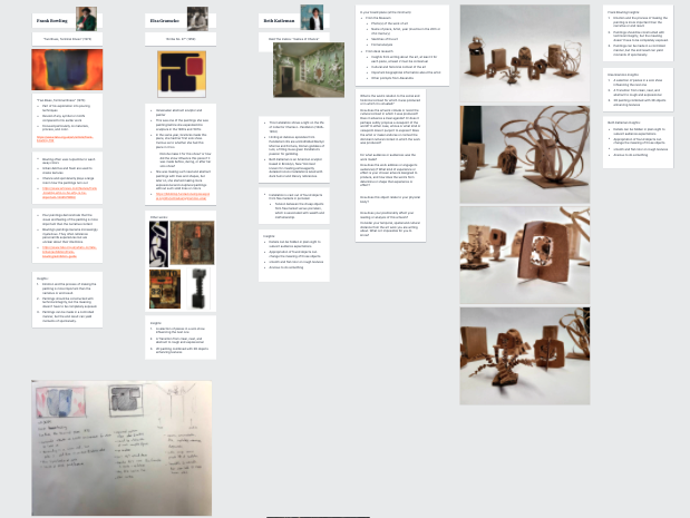
Students kept track of their work in a digital tool I came to rely on throughout the pandemic called Milanote. Milanote both helps students to keep track of their design process and it also provides a virtual desk to see student work when class is remote. I’m describing this process in a linear manner, but what this tool allowed was for students to visually keep each step of this process in one place and to refer back to sketches, artwork, ideas, and prototypes.
To start off this assignment, I wanted students to experience a divergent process and to use their critical thinking to make choices between generative and non-generative insights. Students would eventually be choosing one insight but were initially asked to try out multiple insights: at least three from each of the three works of art, for a total of nine. For homework, students (still in their teams of two) would use each of these insights as the driver of nine small 3”x3”x3” sculptures. Students were directed to stick to one material, to encourage them to focus on form, rather than material, as the expressive element of the sculptures. Because one of the pitfalls of idea-driven form is a tendency towards literal explorations, we ended the day with a short abstraction exercise.
The second class session was designed to guide students toward choosing three of the nine insights to develop further. Students presented the art they chose, summarized their findings from visual and contextual research, and presented their insights along with their 3”x3”x3” sculptures. They received feedback from myself, their peers, and our museum partner, and were then asked, as individuals, to continue parallel prototyping and choose their top three insights.
For homework, the students changed gears and chose three household objects and derived the function or the base purpose of these objects, removing the noun. Breaking down their process of association and assumption and going to the functional core of an object is something that designers eventually do implicitly, but it’s a helpful strategy for beginning designers to think about in an explicit manner. For example, a student who chose a salt shaker might define it as an object that stores and distributes salt, or a watering can would be a device that temporarily holds and then distributes water. Reducing the objects to their function—to its base schema—strips the formal associations designers often have with the objects. The purpose is to give students more room to develop form driven by their insights. Students used their three chosen insights to drive the form of these three household objects. They explored these nine matings with sketches and sketch models.
The third class session was devoted to individual desk crits. Students received feedback on their insights and the forms they created. I noticed that the insights which were easiest to use as drivers of form were specific and succinct and acknowledged a tension in the art. I noticed a few pitfalls as well. Some students chose household objects that allowed little room for formal development, like a bike lever, or a camera. Some students chose household objects that had too much room for formal development with few signifiers of the function: for example, a dog chew toy or a pin cushion. The third pitfall was a reliance on metaphors to express an insight. For instance, to express decay, an ashtray shaped like teeth, or to express “larger forms swallowing up smaller forms” a set of nesting dolls; baggage comes along with these metaphors. By the end of class, students chose the forms that were driven by the insight that excited them most. Their next steps were to explore these further and then to run with their chosen directions.
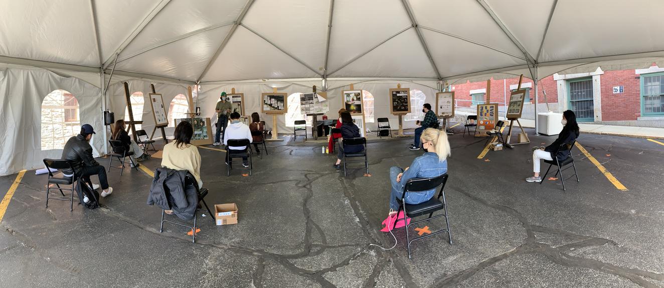
Following an abbreviated spring break, students returned for desk crits on their three household objects. For their final deliverables, the students were again required to create each object out of a singular material to focus the expression on the form. These three objects became a collection driven by one insight. The projects didn’t have to function but signifiers of the function were important. For example, a watering can could be made of foam; it would need a handle and a spout but didn’t need to be hollow or actually hold water. Students were asked to create one to two posters that showed the artwork, their sketch models, any sketches and their final project. The presentation was on our virtual day and the students asked for an in-person review. I reserved the tent next to the Industrial Design building and requested easels. It was windy and loud but nice to be in person. Our museum partner joined for the review.
In the future I would change the assignment in three ways. I would:
- add one more class period
- give students a predetermined list of household objects with a balance of functional signifiers and room for sculptural expression
- revisit the abstraction exercise we did in the first class when students are individually ideating on their forms
- encourage students to align their insights from the analysis of the visual and contextual research. Most students ended up using insights from visual analysis to drive the form of their projects. I believe this was because it’s difficult to take contextual insights and turn these abstract ideas into form (it’s much more intuitive to take a visual idea and create form) and thus the narratives from the contextual research—the historical context, the identity of the artist, etc—were lost. I imagine if students were able to align these contextual insights with formal insights then they could use the formal insights as the drivers for the form while allowing a meaningful narrative continuity with the artwork.
I was impressed with the grit the students showed in working through the new ways I was asking them to think; I was pausing them in places where their assumptions might have propelled them forward. For instance, when I asked them to “de-noun” their household objects, or to use a consistent material for their prototypes, or to think about the form before thinking about the function, they were forced to step outside their comfort zones and stretch themselves both creatively and intellectually.
Art analysis is a good habit-of-mind for designers because it asks students both to look at what is in front of them through visual analysis and to engage in research to understand the context within which that art occurred. As I mentioned above, I am an architect working within an industrial design department, and if I were to generalize about a primary process difference between these two design disciplines, I would argue that industrial design focuses on user research and architecture focuses on context research (and almost completely ignores user research). Insights from either type of research create constraints for brainstorming, solidify teams together around an idea, are a metric against which to receive outside feedback, and help designers choose between different ideas and prototypes. I’ve been curious about how to include both user and context research but have struggled over how one would use two insights to make one decision. Through developing this assignment, I realized that there may be an interesting parallel: if students are finding a connective relationship that works in concert (or tension) between an insight from visual and contextual analysis, could they do the same for insights between user and context research?
—
EXTRAORDINARY ORDINARY: ASSIGNMENT SUMMARY
Class 1: In-Person
- Studio-wide:
- Introduction to visual and contextual analysis and insight-finding
- Teams of 2:
- Visit to the RISD Museum: choose 3 works of 20th- or 21st-century art
- Find 3 insights from each work of art (9 total)
Homework:
- Teams of 2:
- Create 9 3”x3”x3” sculptures that express each of the 9 insights using 1 material
Class 2: Zoom
- Groups of 2 teams in breakout rooms:
- Present artwork, analysis, insights, and the sculptures for feedback
- Individually:
- Choose top 3 insights (from any of the 3 works of art)
Homework
- Individually:
- Choose 3 household objects and define their base purposes
- Mate these 3 household objects with the 3 chosen insights and explore possible forms through sketches and sketch models. 9 matings but as many sketches and sketch models as possible; at least 27 recommended.
Class 3: In-Person
- Individually:
- Desk crits
- Choose one insight for the collection of 3 household objects
Homework
- Individually:
- Ideate on the collection of 3 household objects
- Get feedback from peers
- Choose one direction and run with it
2 day spring break
Class 4: In-Person
- Individually:
- Desk crits
Homework
- Individually:
- Finish project and prepare posters for presentation in the tent
Class 5: In-Person (Outdoors)
- Presentations and conversation
—
Rosa Weinberg is a Cambridge, Massachusetts-based artist, designer, and educator. Her creative practice and teaching bridges focuses on design for the body through assistive devices for disability and design for dance through the lens of architecture, industrial design, engineering, and fashion. This spring she was an adjunct professor in the Industrial Design Department at RISD and this coming fall she will be a lecturer at Smith College teaching architecture.


