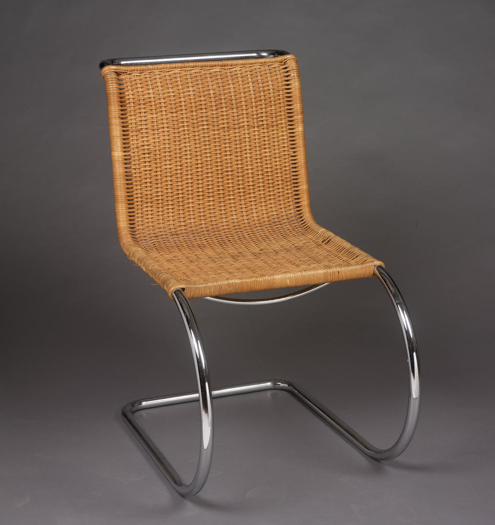
Mies van der Rohe famously said, “A chair is a very difficult object. A skyscraper is almost easier.” I’m reluctant to contradict the architect who designed some of the most influential chairs—and buildings—of the 20th century, but as a RISD architecture student who occasionally makes furniture, I have to disagree: a building is much harder! Or, at least, it’s more complex: even the simplest of buildings has to meet a larger set of demands than a chair, and those demands are often at odds with each other.
Architects have been recognized as key figures in furniture design since the late 19th century, although they’ve certainly been designing furniture for far longer. But what compels them to do so, and how does this kind of design fit into a primarily architectural career?
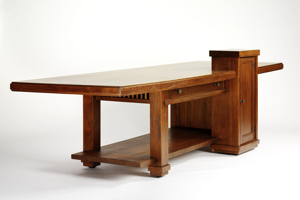
One obvious answer is that furniture can be considered part of an architectural project. Designing a complete environment, both a building and its contents, has long been held appeal for architects. Frank Lloyd Wright (1867–1959) and Josef Hoffmann (1870–1956) both advocated for this type of comprehensive design, and historians often ascribe their efforts to the 19th-century ideal of the Gesamtkunstwerk, or “total work of art.” Wright’s library table, from about 1915, is an artifact of such a project.
Wright is remembered primarily for his architecture, and he generally only designed furniture for specific projects. Even his table seems to be architectural, with the cabinet having the massing of a chimney, and the overhanging top suggestive of his broad, cantilevered roofs.
Hoffmann, in contrast, designed a wide range of furniture and decorative objects that would be produced and sold to a larger audience; Wikipedia calls him an “architect and designer of consumer goods.” Today, a large part of Hoffmann’s legacy comes via the influence of these designs.
At the turn of the 20th century, industrial production was booming, but industrial design was only beginning to emerge as a distinct profession. It was natural that architects were called upon to fill this role.
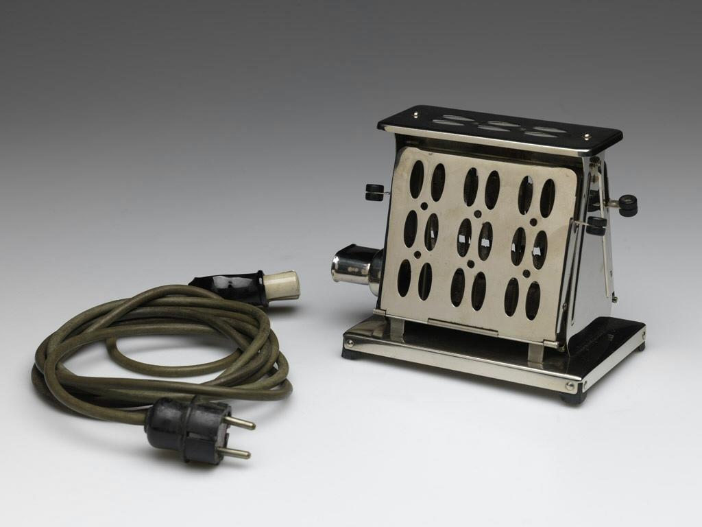
Peter Behrens, for instance, designed not only the AEG Turbine Factory, a fixture of the architectural canon, but also a wide range of consumer products, from teakettles to toasters, produced by the same company.
Behrens, as it happens, was also an influential mentor to several of the pioneers of Modernism, including Mies van der Rohe and Le Corbusier, who in the 1920s designed some of the most celebrated furniture designs of the 20th century, many of which are still in production. (Le Corbusier’s steel-frame seating furniture is used as gallery seating in the RISD Museum, for example.)
Today, however, industrial design is a well-established discipline. At RISD, industrial design, furniture design, and architecture are separate departments, and yet almost every architecture student has at some point made a chair or a table, and today’s high-profile architects are routinely commissioned by high-profile manufacturers to design furniture and other consumer goods.
I’ve always found the design of furniture to be liberating, and the results uniquely satisfying. Part of it is the novelty of creating not just a design but a fully realized, complete thing. As students, after all, we spend most of our time designing things that will never be built, and practicing architects design things which, if built, will be built by other people. The act of making is rewarding on its own, and it’s nice to end up not just with a drawing or a model, but something you can actually use on a daily basis. But none of this explains why so many of today’s most recognized architects, who are used to seeing their architectural designs realized, still jump at the opportunity to design objects which will be produced in faraway factories.
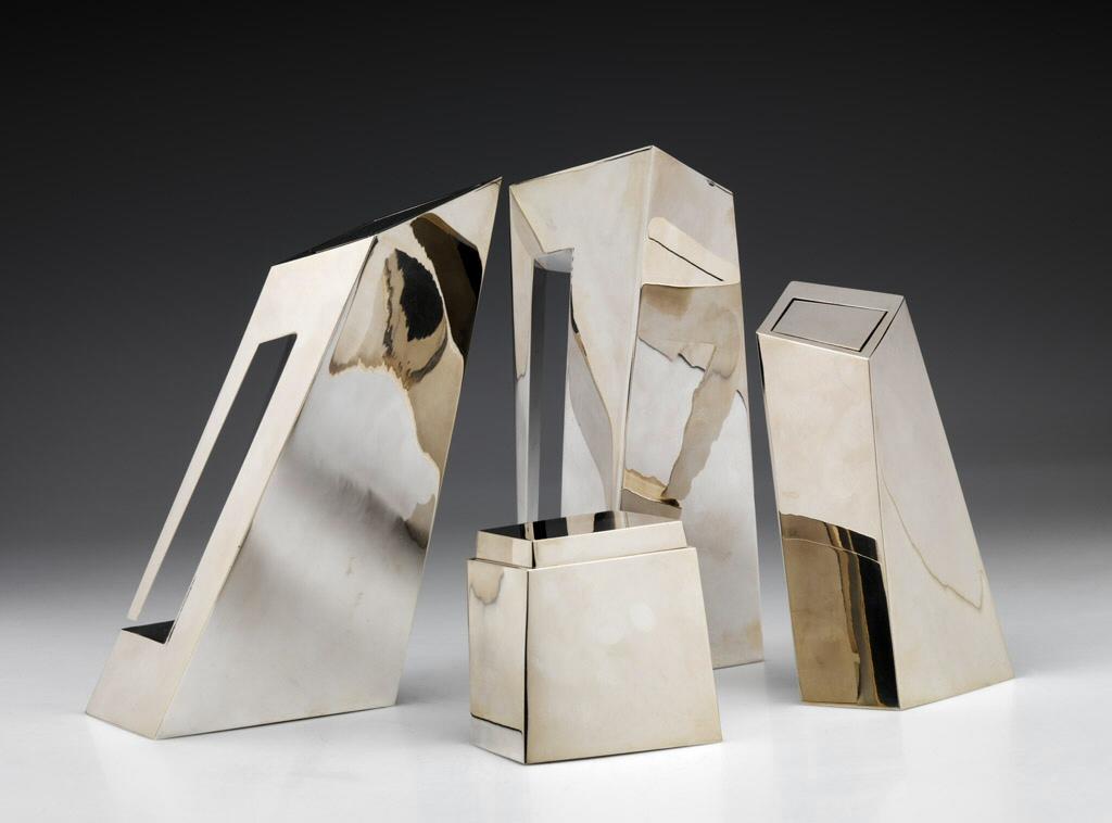
For well-known architects, of course, there is the lure of a greatly expanded audience. Only a few people will ever reside in a building by Zaha Hadid, but thousands own her vases, cutlery, and other objects. Even more people are exposed to these objects when they’re included in museum collections, where they can serve as miniature representatives of the architect’s vision.
Hadid’s silver tea and coffee service reads as an assemblage of dramatically inclined towers, almost like an architectural model. Along with Wright’s table, it falls under the category of “architect-designed objects that look like architecture.”
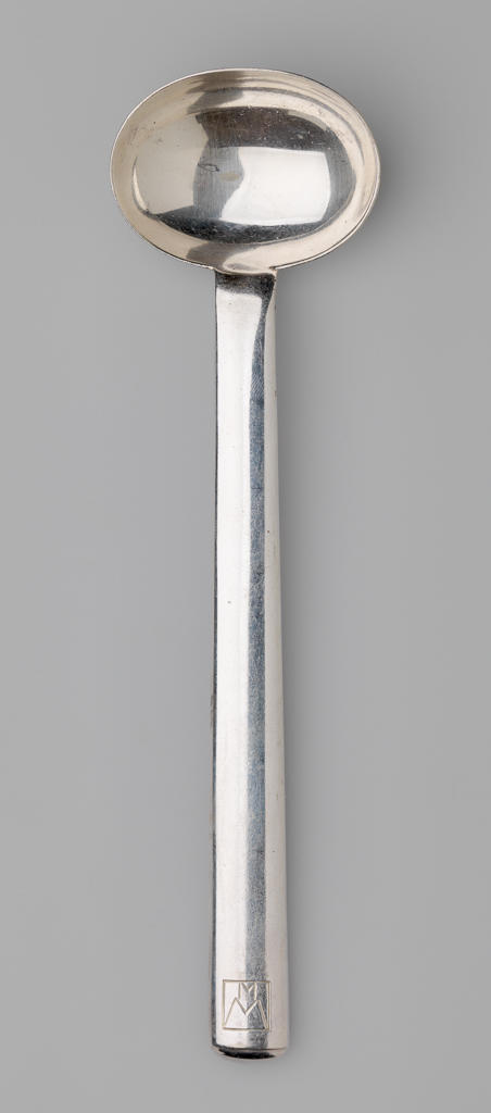
Her cutlery, on the other hand, looks nothing like a building but it definitely looks like her work, clearly expressing the same bold, gestural approach to form which characterizes her buildings and her drawings.
Like many of my colleagues, I include a number of furniture pieces in my portfolio, and I sometimes feel that they convey ideas more clearly than my architectural designs. I think this is because these objects provide a greater opportunity for the pure, direct expression of material, structure, form, and function. In buildings, clarity of structure and honesty of materials are often at odds with the demands of performance and practicality. Buildings have a variety of complex technical demands, and they use a wide range of materials and components to meet them. Because they are large, expensive, and relatively permanent, buildings must thoughtfully address their specific surroundings. Even more dauntingly, buildings must shape, contain, and facilitate a broad range of human experience and activities. A chair simply does fewer things than even the simplest of buildings.
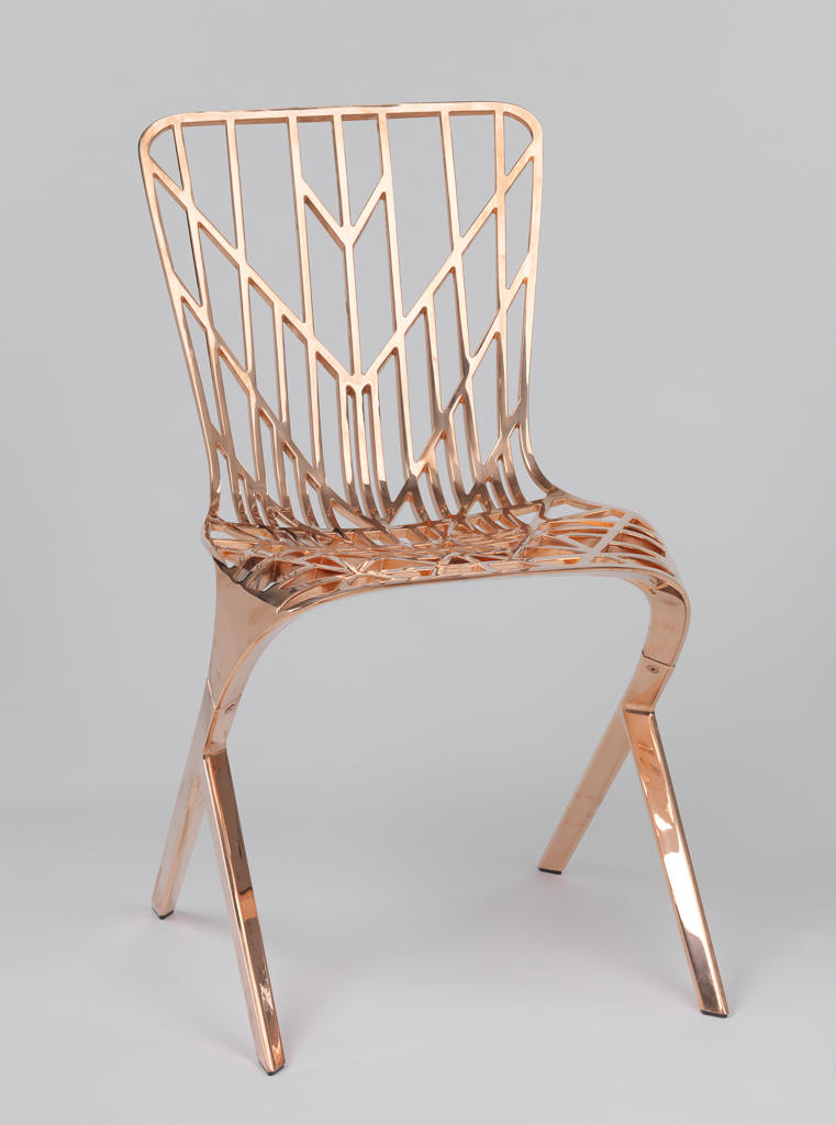
David Adjaye’s Washington Skeleton chair has a clarity of structure and material that would be almost impossible to achieve in a building. It’s a useful case study, since it was actually inspired by one of his buildings, the Smithsonian National Museum of African American History and Culture in Washington, D.C.
Because he was already working on the museum when he was approached by Knoll to design a furniture collection, Adjaye took the opportunity to explore similar ideas and design furniture that related to the building. While it might be tempting to see Adjaye’s chair as another example of the Gesamtkunstwerk, there’s an important distinction. Unlike Frank Lloyd Wright’s table, which was conceived as a part of the house in which it was originally used, Adjaye’s chair was a distinct project with a distinct client.
The museum’s is clad in bronze panels with a filigree-like pattern that Adjaye says are a reference to old Southern ironwork, and part of a narrative about skin. For the chair, the design process began with these same patterns. When they proved to be structurally problematic, Adjaye and his team “analyzed [the structural forces of a seat] and did an extraordinary amount of testing—bouncing a chair thousands of times on its side.” The final patterning and form of the chair were then developed as a direct expression of structure and function. For the Smithsonian museum, the patterned metalwork is only a decorative skin, defining the appearance of the building but doing little else. In the Washington Skeleton chair, it’s both skin and structure, with all of the demands of the chair met by a single material.
Taylor Haywood
MArch Architecture, 2015
Drawing Ambience: Alvin Boyarsky and the Architectural Association is on view April 24 –August 2, 2015.
