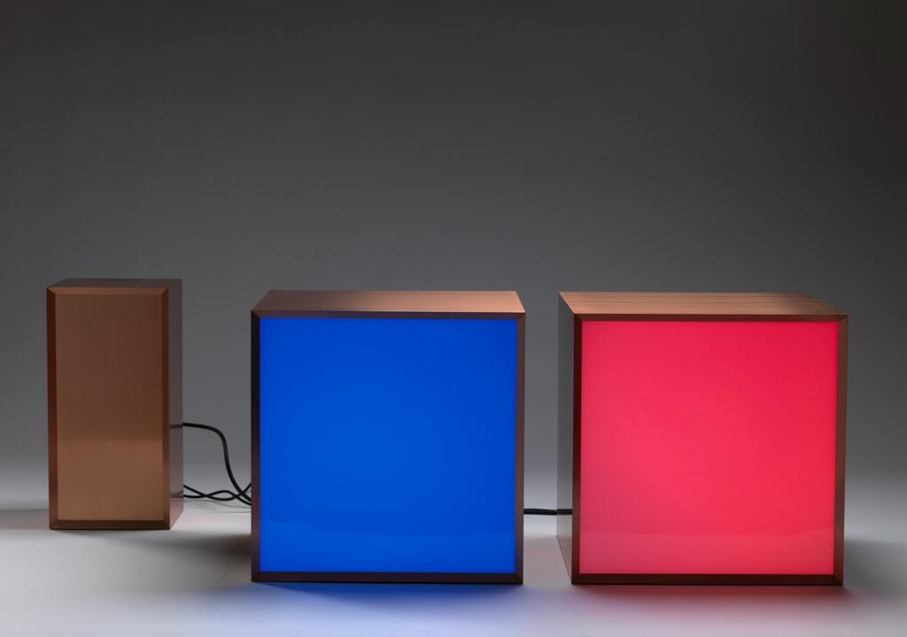
In the flood of digital-ness that comprises our daily experience, it can be easy to forget that most of what all of our complex devices are doing is simply counting. It’s no coincidence that the word digital comes from digits, our fingers, that most elementary of counting machines. What makes our fingers useful for counting is that they are discrete entities, one finger separate from the next. In contrast to the smooth curve of the analog, the digital privileges a sharp-edged order and loses information in the process of encoding. The show Double-And-Add brings together three works that comment on this information loss: from the slide projector as discrete image-maker in Anthony McCall’s 1972 Miniature in Black and White, to the colored pixels of Angela Bulloch’s 2011 Copper, to Haroon Mirza’s digitally decayed sound in Pansonic2, also from 2011.
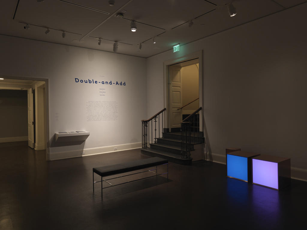
The new media gallery at the RISD Museum is a zone of transition. Situated between the 20th century and 19th century galleries, the space is well positioned to grab the attention of visitors. Each of the pieces in this show uses light and reframes older digital technologies. We wanted the exhibition graphics for the show to maintain the spirit of making old new, while adhering to the rationality prescribed by digital ordering.
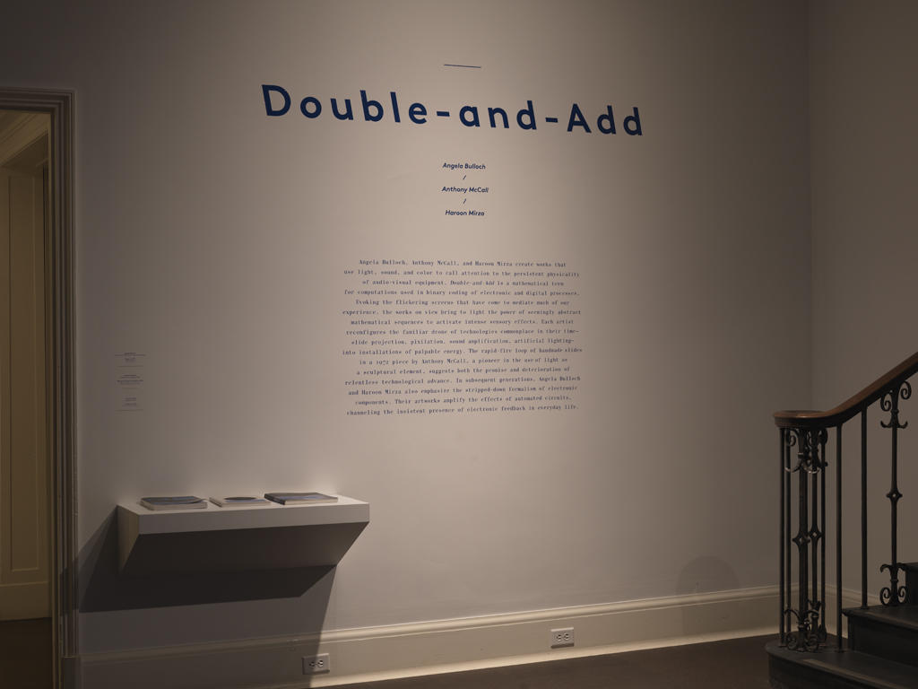
This was another opportunity to use Mononi, a new custom typeface developed for the Graphic Design Triennial in the Woods-Gerry Gallery here on campus this past Fall. The patriarch of rational typefaces, Bodoni, was drawn in late 18th century France by Giambattista Bodoni. His typeface is rational in the extreme, exhibiting very high contrast between the thick and thin strokes, an axis that is exactly vertical, and sharp, hairline serifs. Mononi takes these tropes one step further by squeezing and stretching the type into a monospaced grid, where every character is the same width. Similar to the way that type was designed for typewriters. The forms reference both the discrete nature of the digital and the reinterpretation of historic technologies, while calling attention to the problems implicit in such rigid organization. LL Brown seemed a natural choice for the exhibit title because of its rational geometry as well as its distinctly 19th century reference to backslanted (reverse Italic) glyphs.
Once Mirza’s piece was installed, it seemed like a good opportunity to play off of its RGB LED lighting with the wall graphics. The use of retro-reflective vinyl for the main didactic text picks up subtle color shifts when the ambient light in the room changes with the pieces, and offers an evident bling to the type when viewed from the right angle. The dazzling quality is really unnoticeable unless you are in the right spot in the room, but when you find it—zing!
Colin Frazer studied in RISD's Graduate program in Graphic Design.


